Few things rattle my faith in the survival of our species more than the spectacle of airplane disembarkation. Mind you, the boarding process isn’t exactly a shining beacon of hope, either, but from the time that “ding” indicates it is safe to get out of your seat until the time I step onto the jetway, I can’t help but wonder how we (the collective we) ever got off the ground.
[Hey Google, What's On the Menu?]
When the flight is over, I’m eager to, you know, get off the plane. There are connections to make or luggage to collect or sites to see—or simply things to do rather than stand in the aisle and watch people struggle with leaving the instrument of their airborne adventure, even when they don’t have luggage in the overhead compartment.
Every once in a while, though, an airport can renew your faith in humanity. As you may recall, I went on a bit of a rant in March regarding a digital signage survey positioned just outside of restrooms at two New York airports. While I’m a supporter of most digital signage, this particular application left me wanting to bathe in Purell.
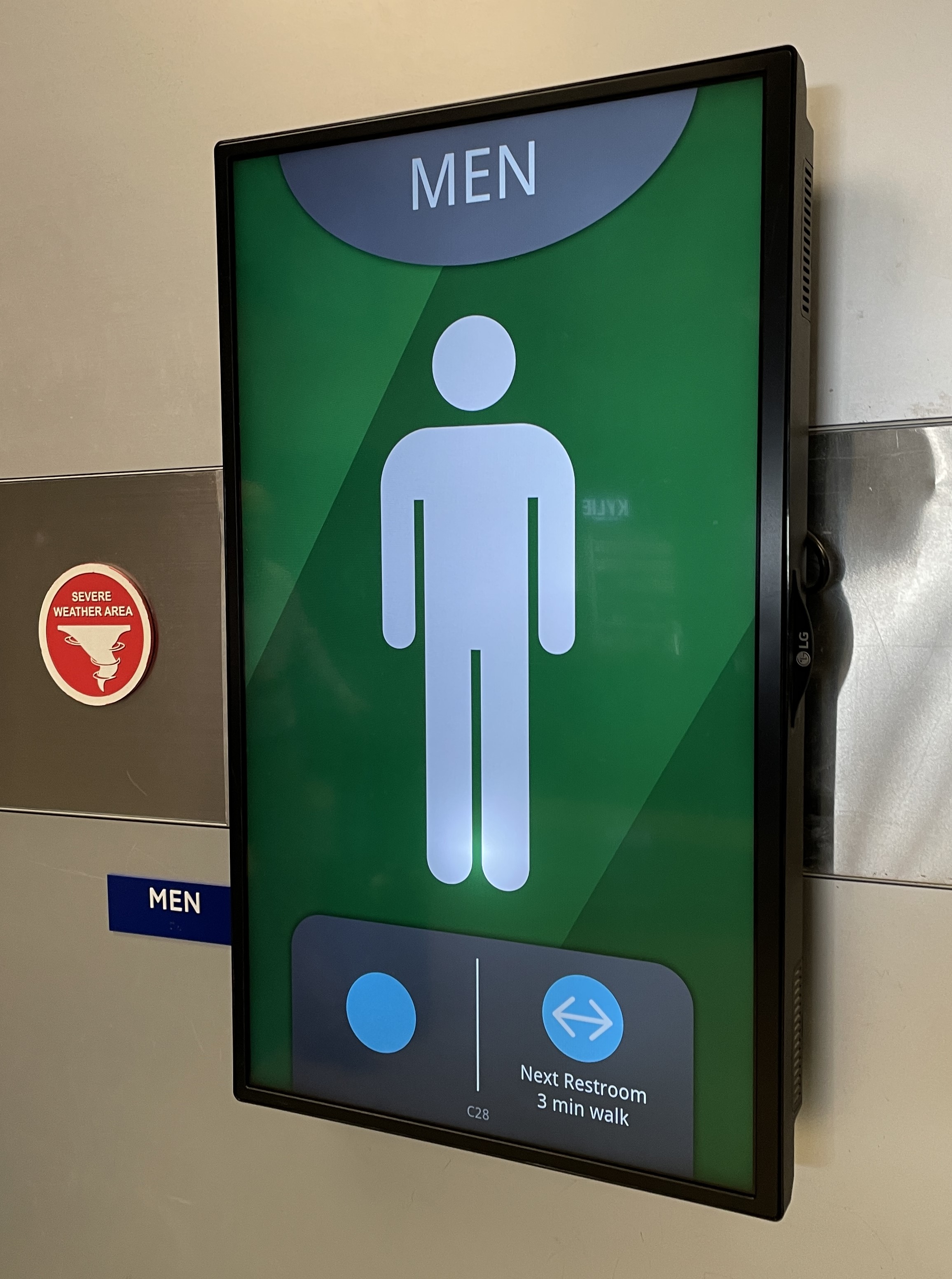
But the Dallas Fort Worth International Airport (DFW) has found an excellent way to incorporate digital signage into public restrooms. I can’t believe I just wrote that sentence. But this solution should put the potty talk to rest for a very, very long time.

DFW has a display showing travelers which restroom is theirs, and a green background indicates that the facility is good to go (forgive me). Plus, the bottom of the sign can provide the number of available stalls as well as wayfinding instructions for other options if the restroom is closed (in which case the background will be red).
Clearly, someone decided that if the DFW terminal was going to update the traditional restroom placard with digital signage, they were going to do it right. The display has real information, and international travelers and even young children can decipher the basic icons and color-coded messaging.
Is your digital signage project as useful as the DFW restroom display? I can’t believe I wrote that sentence, either, but you get the point. Yes, many displays still generate the “wow” factor, and they will continue to do so for some time. However, as digital signage becomes more omnipresent, “wow” will be replaced by “why.” As in, why is this display here and why should I give it my attention?
[How Digital Signage Can Deliver Better Doctor Visits]
Content is king. Relatively few people beyond the readers of SCN are terribly interested in the engineering behind a digital signage installation. No, they want information. Maybe it’s part of an interactive museum exhibit, or maybe it’s a wayfinding map in a shopping complex that can direct them to a jewelry store.
Whatever the use case, viewers want content that is helpful and relevant, but it also needs to be easy on the eyes. The best digital signage finds a balance between content and aesthetics. If viewers need to put on their reading glasses to read the fine print on your digital menu board, it’s time to go back to the drawing board—or at least the restroom.

