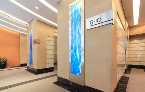
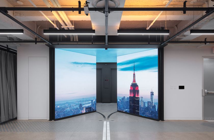
- Two Christie MicroTiles towers are providing a moment of serenity in the heart of downtown Toronto. Located in the lobby of 2 Queen Street East, a 20-story Brookfield Properties office tower catering to high-end clients in Canada’s financial district, the 12-foot tall displays – bracketing the entrance to the elevators – whisper tranquility and calm to both tenants and guests 24/7 with ever-changing content, thanks to Forge Media + Design.
2 Queen Street Lobby
The Toronto-based company had completed the branding and signage for 2 Queen, which sits at the corner of Yonge Street – a busy subway stop – and were then asked to bring their ingenuity to the building’s entry experience for a refresh. Working with the pre-existing nautical theme in the lobby, the Forge team showed the client a mock-up of their idea and they fell in love with the concept.
“They were very excited to have this unique MicroTiles canvas and gave us almost carte-blanche to do this,” said Laurence Roberts, Principal, Forge Media + Design.
Forge replaced the public art that was in the space with Christie MicroTiles – which were both a figurative and literal perfect fit. The design, which captured an Apex Award at the Digital Signage Expo last month, is dubbed ‘Passage of Light,’ and is a simple, yet elegant wind and water-themed generative artwork imparting a sense of serenity to a building filled with people working all hours and living stressful lives. According to Roberts, Forge was “crafting a peaceful, yet mesmerizing moment of Zen.”
“We wanted the display to look different every time someone saw it, so they didn’t feel like they were seeing a repetitive loop. Especially because this is a busy hub with not only the people coming into the building lobby, but people on the transit lines who see it along with all the pedestrian traffic,” said Roberts. “People can look inside any time from the street – it’s like a fishbowl – so we took advantage of that and used the idea of attracting attention with color and light. This is why we started with the concept of light passing across the top of water, giving an open sky-like image, and the shift of hues that transpire over the course of the day. Since we’re blending all of these custom gradients, you will never see the same set of colors exactly the same way twice. The gradients are constantly moving and shifting so it creates a very broad, but refined palette. There is also a wave-form, which is a fractal 3D mesh that we created that uses real-time wind data to establish the feeling of water and movement. Whenever the wind picks up, the form and oscillation of the wave will naturally increase.”
Roberts said his team had wanted to work with MicroTiles before and aside from the literal fit, the color reproduction was ideal for this project.
“The colors needed to be vibrant, but not sweet. There is a depth of color that comes with Christie MicroTiles, and they remain true even in bright light, unlike other displays. This was critical, because the MicroTiles are located in a sun-soaked area of the lobby," said Roberts. “We didn’t want it looking garish; we wanted it looking true to form and our original vision, which you don’t get out of some displays because they sometimes push the saturation too far. With the MicroTiles, however, there is a softness, which is what we wanted. The client is thrilled with the result.”
