We live in an increasing data-rich world, where forward-thinking organizations are harnessing the power of analysis to make better decisions.
To make this happen, the people who collect and crunch data have to present their conclusions to decision-makers in a clear, concise way. Otherwise, the meaning can get lost in the message. All the numbers and associated facts can end up inundating managers, rather than informing them.
Nowhere is this truer than in AV presentations, where too many pie charts in PowerPoint can bore audiences to tears, rather than energizing them into action. This is why visualizing data effectively and meaningfully must be an organizational priority. Here’s how to do it.
DISTILL THE MESSAGE
The old computer programming adage, “garbage in, garbage out” applies to planning effective data analysis presentations. The presenter needs to decide right from the start what fundamental conclusion(s) they want the audience to draw from their presentation. They then need to tailor their spoken word content and graphics to deliver this message clearly and obviously, without excessively resorting to simple-minded repetition.
A useful rule of thumb can be found in the news media, where the approach to writing a clear story is: 1) Briefly prime the reader what you’re going to tell them. 2) Tell them the information, clearly and sequentially; 3) Conclude with a brief recap.
CHOOSE GRAPHICS THAT COMMUNICATE
It’s a time-worn cliché: A data presentation that combines a droning speaker reading from a boring script while endless pie charts march across a projected PowerPoint screen. The only audio competing with the cricket noises emanating from the audience is the sounds of their snores.
To keep this from happening to you, it is vital to a) choose graphics that communicate your message clearly and b) offer something new and different to visually engage your viewers.
Utelogy co-founder and CEO Frank Pellkofer achieves both goals by using third-party programs to create unique and informative graphics. (The Utelogy software platform delivers non-proprietary AV control, management, analytics, support and document storage on any network and any server, virtual or otherwise.) “If you really want your datarelated graphics to stand out, then avoid using the canned graphs and charts in PowerPoint or Excel that are run of the mill, mundane, and often leave us not really making the point we were intending to make,” he said.
BE INTERACTIVE
The cliché of the droning data presenter with pie charts points to another problem with traditional data presentations: They rely on experts speaking at the audience, rather than facilitators interacting with them.
When presenters act as facilitators, actively soliciting their ideas and input while guiding them toward the message that they’re trying to get across, something magical happens: the audience gets engaged. No longer are they grade-two students stuck in class having to listen to the teacher. They are now adult participants in a joint discovery process; one in which data analysis is the road to knowledge and action.
“The idea of one person presenting and a bunch of people listening is dated,” said Robert Abbot, vice president of products with Nureva—a technology company focused on developing advanced solutions, like Span Workspace and Nureva Wall, to support collaborative teams and processes. “The right mindset to have is that you’re in a discussion—and if you’re in a discussion, you need to have the right tools so that people can share their points of view.” (Nureva’s solutions allow audience members to submit electronic “sticky notes” to a cloud-based Span canvas during presentations. This ensures that all participants, whether in the room or dispersed, can offer input when they think of it, without distracting the presenter during their talk.)
“If you can change the context from a presentation to a conversation, then you’re in good shape,” noted David Kung, VP of product strategy for Oblong Industries. (Oblong makes Mezzanine, a visual collaboration solution that lets teams see, share, and work with all the content they need, all at the same time.) “When your viewers can contribute their own data and see it side by side with yours, then you’re experiencing true knowledge sharing.”
BREAK FREE OF THE SINGLE SCREEN
The final element of the droning data presenter cliché is the fact that they use one big screen. There is no variety and no innovation: The text, pie charts, and other canned graphics flash up on this single screen in a monotonous progression, like a boring parade that everyone hopes will pass soon.
Making matters worse is the fact that “we often need to compare, contrast, and cross-reference multiple sets of data at the same time,” Kung said. “In addition, the data often comes from different sources, even different locations. Since most presentation spaces only let us see one set of data at time (often via a PowerPoint slide), we’re forced to constantly switch back and forth between slides or devices. This process is both inefficient and mentally taxing.”

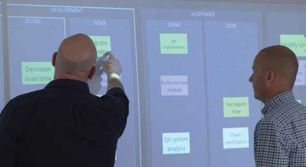
The solution to the single screen straitjacket is to move to digital working walls and multiple screens, either physically or virtually (e.g. visualizing and interacting with all team content on one large visual canvas). This is the model supported by Nureva’s Span Workspace (which creates a digital visual canvas up to 200 feet wide, and Nureva Wall (from 7.5 feet to 60 feet wide), and Oblong Mezzanine (which creates an interactive digital canvas of flexible size with multiple displays spanning multiple wall surfaces). Using multiple screens, the presenter can move between graphical ideas, dragging and dropping items visually as they interact with the audience to keep things lively.

“[With multiple screens] you have greater choice and the problem shifts from thinking of the most effective presentation to selecting the most salient data,” Kung said. “You also have greater freedom: You can bring in an actual application and work with live data instead of a representation of the data on a slide.”
Presenting data using multiple screens and a large, flexible visual canvas allows “presenters to determine the best techniques for presentations based on the specific details of each audience, facilities, and objectives,” said Rick Kennedy, Nureva’s director of customer engagement. Doing so “can optimize their results of any session,” he said. In contrast, “constraining presenters to a single method will make it easier for presenters, but less effective for the audience.”
GET OUT OF THE RUT
Clearly, data presenters can do a lot to make their content compelling and engaging for their audiences. Doing so will certainly up the entertainment value of their presentations, but the primary reason for doing so is far more important: Delivering interesting, interactive presentations improves the odds that their audiences will absorb and utilize the data analysis that the presenter is working so hard to get across.
In a data-driven business world, this kind of effective AV presentation matters. Increasingly, top managers in business, education, government, and military organizations need timely data analysis that is pertinent, to the point, and easy to digest to make the right decisions. Bore them to death, and the data intelligence that researchers have worked so hard to compile will go unused—and the organization will suffer.
This is why effective, meaningful data analysis presentations are truly important. Using the right AV tools, messaging, and interactivity, today’s data presenters can succeed in getting their content across to their organization’s benefit—but only if they reject the worn-out droning lecturer/PowerPoint/single screen approach.
James Careless is a regular contributor to AV Technology, and a long-time reporter on the AV/broadcasting scene.

