When InfoComm International published its series of Dashboard for Controls documents in April 2005, Apple’s iPhone was almost two years away from launching. A decade later, InfoComm’s leadership is helping guide the creation of touchpanel control interfaces, and promoting intuitive end-user operation of pro AV systems has been somewhat usurped by the now-ubiquitous handheld device.
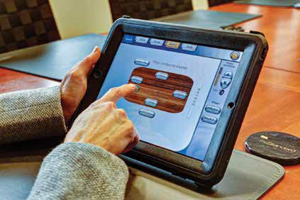
“Everybody knows how to use a touchscreen, because everybody has one in his or her pocket,” said Mark DiQuinzio, manager of AV engineering at Diversified Systems. “Ten years ago, people were frightened of touchpanels. Now they just accept them.”

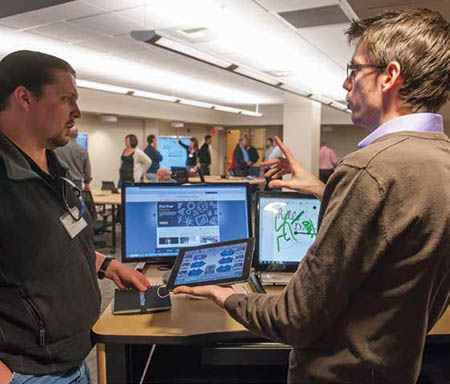
The University of Idaho commissioned CompView to design a collaboration room for its hands-on training of Idaho elementary, middle school, and high school teachers, as well as their own professors and staff. As handheld devices have flooded the market, consumers have become savvier about touchscreen operation, which in turn has evolved as consumers have become more sophisticated, resulting in a virtuous circle. “If you notice the earlier designs of touchscreen phones compared to how they are now, they’re much more streamlined and they have less detail,” said Dave Theis, corporate system integration director at CompView. “Before, where they used to show buttons, they now show only text, because you know that you’re supposed to touch it and something happens. So we have this gigantic moment of training built into society.”
Control system user interface (UI) designers can use that education to their advantage. “We have progressed to a more advanced level of user, and that means that we can put more information on a panel than we used to be able to,” Theis continued. “It becomes more highly functional because you can have higher level access to things without having to simplify it as much as we used to.”
But consumers’ increased sophistication and their familiarity with apps—there are reportedly now more than 1.3 million Android and 1.2 million iPhone apps—can be a doubleedged sword. “Now that people spend all their time on their iPhones, Android phones, or whatnot, we have to compete with the user experience of all the thousands of apps being developed every day,” explained Matthew Kosel, design coach and technology leader at Spinitar. “That’s a very difficult hurdle, because the reality is that the iOS or Android platform is not capable of the work an AV control system needs to do.”
But conversely, UI toolkits from companies such as AMX or Crestron don’t necessarily mimic the iOS or Android experience. “The graphics, smoothness, operation standpoint, pop-out menus—we still don’t have those tools available to us on those platforms,” said Kosel. “Even though the hardware and software is a more efficient approach solution.”
For the majority of clients, the UI defines an AV system, “because that’s the only part that the user interacts with,” noted Theis, whose company employs traditional software engineers that are able to take advantage of the more complex tools. “[Most clients] have no concept of a rack of gear behind a curtain, and I don’t think they’re particularly interested in what that rack of gear is.”
“The UI is often the best description of the capabilities of the system,” Kosel agreed. “Spinitar is a solutions provider; we do resell equipment, but we often try to sell our customers on a solution as opposed to all the parts and pieces that make up the solution—because often a solution can be less than the sum of its parts.”
He elaborated, “We use parts for very specific functions. So even though they may be capable of other functions, those functions may not fit within the context of the system.” For example, there may be a Blu-ray player in the system, and while it might be enabled for Netflix, that functionality is not going to be supported in the AV system or on the UI.
“It’s not uncommon for us to create a GUI that’s very restricted, with some hidden pages that are accessible only if you have a passcode,” said DiQuinzio. “It essentially gets you to a level that offers more functions and more control, but is really only there to be used by a trained operator or a support tech.”

CompView has progressed to a more advanced level of user, and that means that they can put more information on a touchpanel than they used to be able to, according to Dave Theis, corporate system integration director. “There’s an appropriate level of information for the application,” said Theis. “If it’s an executive that’s walking up to a panel in a fresh space for the very first time, that dictates a different level of interface than someone who’s a technical operator doing maintenance on the system.”
Any attempt to create a standardized UI might be overly optimistic. But as Kosel noted, “Some standardization is applicable. But we still find it difficult to apply a smaller selection of templates to a larger percentage of the projects that we do, for multiple reasons: small functional differences, or aesthetics, or graphic design concerns.”
DiQuinzio certainly promotes consistency, if not standardization. “One thing that’s important is you try and keep the same buttons—volume, mute, source selection—in the same locations on every page, because then you don’t have to hunt for anything,” he said.
Diversified Systems’ corporate clients are typically national or multinational, which does allow a standardization of the UI throughout their business. “We help them to develop standard room types that they can then deploy anywhere they have an office,” said DiQuinzio.
Enterprise-wide standardization certainly makes it easier for the tech support department, he observed: “If the rooms don’t all work the same way, the support technicians have to learn the different ways the rooms work.”
On that subject, he added, “We now put a web camera in the ceiling of every AV room. If someone calls in, the tech can see what is on the screen. For $150, it just makes the support process so much faster.”
That said, the trend for small huddle rooms is eliminating the UI in some corporate environments, said DiQuinzio. “We’ve done a lot of rooms where you plug the laptop in, and it automatically turns on the display and sets a volume level. You don’t have to have any interaction if you don’t want to.”
“We’ve found that we couldn’t get away from touchscreens entirely, because there’s a certain amount of information on a more complex system that needs to be displayed and acted upon,” said Theis. “One of the things that we’re really finding out in AV is the number of things that you can intelligently figure out and just take care of for the user. In the old days, we used to have device power on everything, but now, with advances in technology, we can just automatically handle things like that in the background. And the more things we can automatically handle, the simpler the interface needs to be.
“Keep in mind that there’s a tradeoff between flexibility and complexity in a system,” Theis cautioned. “Things that get automated are really great when that’s exactly what you want to do, but they can also turn on you and fight you when you want to do something different.”
Eventually, perhaps, a UI may no longer be required, according to DiQuinzio’s colleague at Diversified Systems, Jim Pennucci, a gold-certified Crestron programmer. “We’ve had discussions about getting to a system where, if the client schedules a meeting and the resources in whatever scheduling tool they’re using, and they walk in with their RFID card, the meeting just starts,” he said. “We’re not there yet, but we’re pretty close to being able to do that.”
Steve Harvey (sharvey.prosound@gmail.com) has been west coast editor for Pro Sound News since 2000 and also contributes to TV Technology, Pro Audio Review, and other NewBay titles. He has more than 30 years of hands-on experience with a wide range of audio production technologies.
