Lisa Cohen knows a lot about digital signage––and, most importantly, how to create engaging content that people actually want to look at. The erstwhile program manager for environmental media for the financial news, data and technology behemoth Bloomberg LP, over the course of her 13 years with the company she has been involved in developing both inward and outward-facing content for the organization’s headquarters in New York, N.Y., and its satellite offices around the globe. Through Bloomberg, she has also worked on projects at the London City Airport, as well a three-story Morgan Stanley-branded display in Times Square. Her secret to getting people to watch what’s up on the screen? Remember that it’s not really about the screen.

“Often it’s, ‘let’s put up a screen. What do we want on it? Oh, that’s secondary—we’ll think about that after.’ And it really needs to be primary because it can affect where you but the screens, it can affect [the screen’s] shape, the size, the resolution,” Cohen said. “The content is really the first thing that should drive anybody to purchase and hang screens in any location. What is it that you want to show? That’s the most important thing.”
It’s also necessary to assign someone—or several people—to content creation, and companies can approach this in several ways, says Richard Daugherty, digital media solutions engineer at AVI-SPL, an AV integration firm headquartered in Tampa, Fla. “You have to think about: what are the resources that we’re getting our content from? And who will be designing it?” he said. For some organizations, one person may have the capacity to handle content design all the way through to delivery on the displays; others may dedicate several team members to this. And others may outsource content creation (a service that AVI-SPL offers).
Michael Cronan, manager of digital signage solutions strategy and development at Panasonic, headquartered in Newark, N.J., encourages organizations to think about continual content updates, and how they’re going to execute them. “You want to constantly provide information and entertainment that is really engaging, [and] the only way to do that is to constantly be touching it,” he said. “The management of your system should be thought about in advance. Once you get it up and going it’s great, and everybody’s happy. Let’s think about Day Two: how do you take care of that system?”
With this in mind, here is what your organization should consider when discussing content for digital signage deployments:
Know Your Environment

Digital signage isn’t really all about the screens, but it is very much about the environment in which it lives. How is the space in question being used? Is it a lobby—somewhere people go to meet and greet? Is it an office where, for the most part, employees are expected roll their sleeves up and focus on their work? Who is your audience? “Then you look at the architecture and think about: where can these screens fit in seamlessly?” Cohen illustrated. “You don’t want them to feel like a rectangle that’s just plopped on the wall—you want them to look beautiful and seamless.” Viewing distance also comes into play here: where will people be when they’re watching your displays?
Once you know what you want to show, where the screens are going to be, their size, and their shape, then you can think about design. “This will determine your font size, [and it will] determine your animation,” Cohen said. For example, if the display is a long, thin, and ticker-shaped, then you may opt for a lot of left to right animation.
Yes! Less is More
Daugherty notes that screens jam-packed with information are ineffective. “The average dwell time for digital signage is seven to 10 seconds,” he said. “It’s almost like a billboard that you see on the highway: it’s basically bold text, an image, and a tagline, and the company’s URL [that says] ‘for more information, visit us here.’” If you really need to direct people to something that is text heavy, he suggests incorporating a QR code on the digital signage display so that viewers can scan it with their smartphones and walk away with the rest of the information they’re interested in.
Make it valuable or don’t make it at all

Obviously, Bloomberg displays a lot of market information: commodities, world equities indices, up-to-the-minute information on foreign exchanges, and stock prices. At London City Airport, Bloomberg’s digital signage also provides viewers with information on time zones and weather reports—things that travelers want to know. Cohen believes that one of the keys to making signage engaging is to give people something of value. “[For example,] you’re boarding an airplane and you see up on the screen some really interesting fact that you think you can bring to the conversation that you’re going to have when you land,” she illustrated. “Or, if it’s a screen in an elevator, give something to the people in the elevator that might make them strike up a conversation. Give people something of value that they can take with them and share elsewhere.”
You need a content strategy
If you want to keep your content fresh—and you should, because when it’s not, it’s ignored—you need to have a sustainable content strategy that accounts for how the displays are updated. Updates should be an easy task—one that may even be automated.
But how do you figure out what to show when? Cohen suggests dividing content into separate “buckets”: for internal communications, you might have a sales bucket that displays sales information; another bucket for employee recognition messaging; and perhaps another one for announcements pertaining to what’s happening in R&D. From there, you can examine how you want to program your messaging. “You can make sure you have all your buckets filled the way you want: maybe you want it to be 50 percent business, 30 percent culture, and 20 percent something else,” Cohen explained. “That way, you can go to management and say, ‘this is what we’re communicating.’”
Templates, Templates, Templates
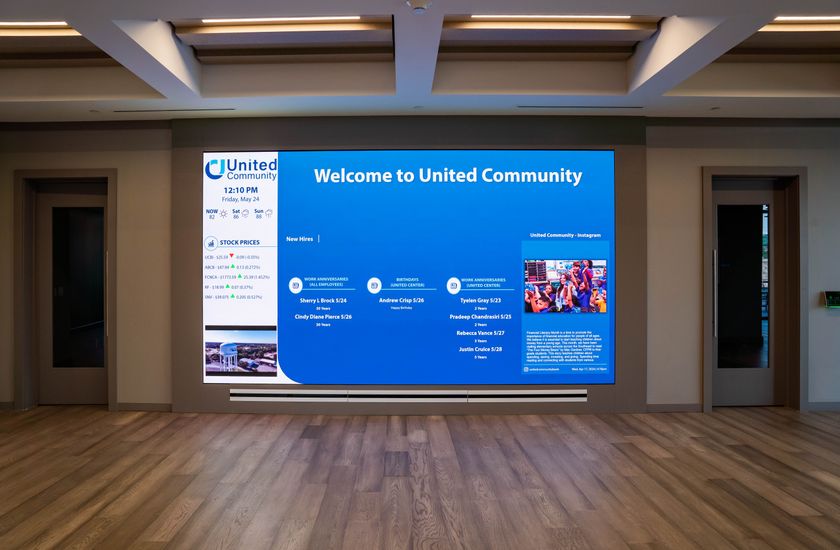
While you want to keep your content fresh and new, it’s unrealistic for teams to reinvent the wheel each time they want to produce a new item. “In terms of production, you’ve got to think about templates,” Cohen said. Say you run a continual spot on anniversaries that celebrates how long specific employees have been with your organization: with a template, all you need to change each time is the employee’s name, their photograph, and their anniversary date. And, that template—which basically comprises a photo, a headline, and a caption—could be used for a number of other spots. To make it look different, sometimes all it takes is changing the template’s color.
Image is Everything
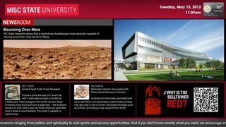
Templates are great, but templates adorned with cheap clip art will look, well … cheap. Daugherty notes that you don’t have to spend that much on high quality images. He points to subscription services like iStock and GraphicStock that offer quality images for exactly these purposes. “There are tools out there that assist you in speeding up the process and making it less painful, or not painful at all,” he said.
Social media: engage with caution
While integrating social media into your content is unquestionably a way to engage people with your digital signage, it also presents the risk of people posting negative comments about your brand. “If you have something that’s public-facing without any filtering, it could become an awful mess,” Daugherty said. This doesn’t mean you need to exclude social media from your content strategy, however. He cites one instance where a client wanted to project their Twitter feed on the side of their building: the company enlisted a third-party provider to conduct filtering for them. “If you tweeted something it would be a while before you saw it, but it was still as close to real time as possible.”
Integrating social media with internal-facing signage, however, doesn’t pose the same risk, unless the company’s culture is so conservative that they don’t want to expose themselves to employees saying negative things about, for example, a recent company event. “Someone is going to tweet out what a great event that was, and someone [else] is going to say, ‘I didn’t like such-and-such a thing,’ and they’ll go down that rabbit hole,” Cohen said. A situation like this could make those charged with the digital signage content sweat a bit, she admits, but that can be positive. “There will be a lesson learned, and the organization will grow from it. You just need to be open and ready for it.”
It’s an experience, not a lecture
For Cohen, digital signage is about more than video, or a video player playing back videos—it’s about creating an experience. “I don’t call it digital signage, I call it environmental media, and you could also call it experiential media,” she said. “You’re creating an experience and you’re using media, and you’re involving the environment, your physical structure, and the space that you’re in. You’re altering someone’s experience of where they’re standing, where they’re living, where they’re working.”
Carolyn Heinze is a regular contributor to AV Technology.
INFO
AVI-SPL
www.avispl.com
Bloomberg LP
www.bloomberg.com
Panasonic
https://business.panasonic.com/digital-signage-solutions.html
“If you have something that’s public-facing without any filtering, it could become an awful mess.”
