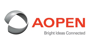
- AOPEN has just unveiled a new brand identity that symbolizes its vision for a future of innovation, openness and partnership.
The new logo is part of AOPEN's strategy for the fast-growing digital signage sector, which is forecast to exceed 40 percent in 2013, growing to U.S. $7 billion according to IMS Research. AOPEN has an ambitious global expansion strategy, the company says, with a key focus on retail, the dominant vertical of the signage sector.
AOPEN CEO and president, Bernie Tsai says that the company evolved and grew into an industry leader based on its innovation, the reliability and performance of its technology, it was an ideal time to create a new identity for the next phase of AOPEN's future.
"AOPEN is a truly global company. We want our image to reflect our passion for transforming our customers' businesses and driving their success. We also want to show our commitment to a global vision for digital signage and appliance computing, using best of breed technology to create powerful, universally accessible solutions," Bernie Tsai said.
"This is more than just a new brand. This is AOPEN's message to the world about the groundbreaking new digital technologies we are developing, our drive towards open architecture and products, and our vision for a future of innovation, openness and partnership."
AOPEN has developed a universal, holistic, end-to-end digital communication strategy through its OpenService initiative. OpenService is an alliance of hardware, software and content creation partners, that seeks to simplify digital signage and create best-of-breed solutions, leveraging AOPEN's expertise and technology leadership.
AOPEN partnered with Australian-based designers RED DESIGN GROUP to create its new look. RED's approach was to create a strong point of different, and to engage with AOPEN's values of collaboration, partnership, sharing and openness.
RED's digital design director, Carl Thompson, says the new identity was created in three stages. First, a strong, simple and contemporary typeface was chosen to reflect AOPEN's modern, global face. Next, to communicate movement, harmony and energy, a dynamic logo was created consisting of rotating slices, or segments, forming a circle. Color was then the final element to take the AOPEN brand into the future.
"We first designed the logo as an animated graphic because most of its uses would be digital. When the animation was frozen, the shape of the new logo emerged," Carl Thompson explained.


