Highlights of the Silver Awards
The 2008 (POPAI Outstanding Merchandising Awards (OMA) Contest celebrated its 50th Anniversary this year, and the Awards were presented at Globalshop in Chicago in March. In the last issue, we brought you some insights into the OMA Display of the Year Award winners; the Digital Signage Display of the Year winners; the Creative Best of Show winners; the Digital Signage winners; and a broad selection of Gold award winners from among the many 2008 Outstanding Merchandising Achievement Awards categories.
In this issue, we take a look at some of the Silver Winners, from among the Temporary, Semi-permanent and Permanent categories, further broken down into 28 categories such as Cosmetics, Entertainment, Snack Products & Soft Drinks, Electronic Interactive and Technology, Health Care, Home and Garden, Toys, Beverages, and more.
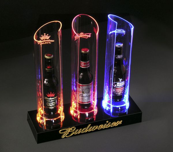
Array for Anheuser-Busch Budweiser Brands
SILVER WINNER: BEVERAGES - BEER, PERMANENT
Designed in May 2007 for Anheuser-Busch, Inc. by Array (www.arraymarketing.com), the Tri-Bottle Glorifier presents three Budweiser brand beers in an eye-catching, uniquely lit display designed to stand out and create brand awareness in an aesthetically busy bar environment. This under $50 display was designed to be eye-catching using innovative LED technology enhanced with specialty acrylics. Three mitered tubes, each a different color of tinted acrylic, plug into the LED up-lit base. Minimal electricity creates the impact of a neon sign. Each edge lit feature tube transfers and tints the light at its edges creating a dynamic frame around each real Budweiser brand bottle. Each tube is a different hue, expressing the three brands in the family. Each tube has its brand logo etched into the acrylic causing the LEDs to light up the logos in a dynamic way. By creating a vibrant, branded counter display that utilizes actual product, Budweiser helped the customer more easily identify that the bottles are a part of the Budweiser family. The lighting is unique and eye-catching highlighting three brands of Budweiser beer on a Budweiser branded base. The Tri-Bottle Glorifier arrived fully assembled. The retailer had only to place the appropriate bottles in each of the three tubes and plug the unit in. The large impact within the small footprint maximized the use of space and the LED technology minimized energy usage for the retail establishment. The neon look of the unit fit well within the bar/restaurant environment. All 1000 initial units were successfully placed in the field. This unit saw a 2nd reorder, showing a positive field result.
Menasha Packaging Company for KitKat - Caramel
SILVER WINNER: CONVENIENCE STORE RETAILER, TEMPORARY
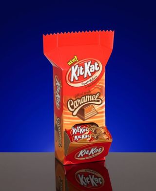
Produced in December 2006 for the Hershey Company by Menasha Packaging Company (www.menasha.com), the KitKat Caramel display launched the new candy bar, boosted sales and built the brand with a small footprint for high-traffic convenience store locations. Innovative features on the under $10 displays included a unique zigzag top flap that looked like the end of the wrapper, and a jaw mouth at the bottom for great visibility to the product. The restockable unit had a very small footprint - only 5.25" x 3.75" - to place in several high-traffic C-store locations. The design included an innovative factory gluing pattern for strength and easy set-up plus eye-catching 5 color litho and durable E flute. The attractive design was eyecatching and the graphics provided an excellent product shot tied into the KitKat logo. This unit enabled convenience store retailers to place in a variety of high-traffic locations, to restock easily and to boost add-on sales especially at registers and beverage counters. The units were small enough that sales reps could carry them into stores to draw attention to new flavor and then set-up with minimal effort. The displays become a striking four-sided billboard for the brand and the new flavor, building brand recognition for the entire KitKat line in five-color litho E flute. Initial forecast of 3500 units was increased to 8000 units after mock-ups and sell sheets had been produced. Those moved so quickly, another 1500 were run. The display stock barely lasted one week.
Array for Sephora Category Endcaps
SILVER WINNER: COSMETICS-WOMEN, PERMANENT
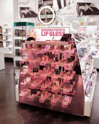
Produced in September 2007 for Sephora USA LLC by Array (www.arraymarketing.com), these under $1000 category end caps create three distinct and intuitive shopping designations at the end-of-aisle where consumers can shop for select best-in-category product. The 300 deployed end caps develop a refined and elegant updatable merchandising system using modular components that can accommodate any brand (size /shape) of product with minimal customization, while maintaining a unique "floating" aesthetic appeal. Three variations on the category end caps identify them as specific for Bronzers, Concealers, and Lip Product, while maintaining a familial feel. Molded acrylic modules on a brushed nickel frame allowed for a color-coded flawless translucent finish integral to the clean, 'iMac' feel of the design. Because the category end cap merchandising systems are so unique to anything else in the store, they become a point of interest drawing customers' attention and consideration, offering easy tester comparisons and a point of new brand discovery for the browsing customer. Updateable labels listing key product benefits are located directly in front of each tester, making for intuitive shopping. The labels are protected by a clear acrylic frame keeping the tags in pristine condition for the duration of the display. The Sephora Category End Caps were designed for easy installation and cost-effective updateability. The Category End Caps were designed to fit within a minimal foot print of 10-feet deep and yet had could stock and test a large number of products while maintaining a clean, airy appearance thanks to interchangeable modules of specific sizes, spaced evenly to create a visual sense of order, uniformity and spaciousness. Merchandising saleable product in a bin-like system provided more flexibility than with a traditional "columned" system; therefore each module became shallower. The success of the Bronzer, Lip Sync and Concealer end caps has produced interest in using the same design in other locations within the store, such as inline along the wall and within the gondola. The end caps have been so successful that Sephora is looking at using the system to merchandise additional categories as well as other product lines such as fragrances and skin care.
Drissi Advertising, Inc. for Evan Almighty
SILVER WINNER: ENTERTAINMENT, TEMPORARY
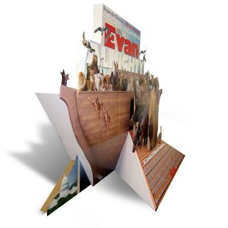
Produced in April 2007 for Universal Studios by Drissi Advertising, Inc. (www.drissi.com), the Evan Almighty standee was designed to generate excitement for the film's theatrical release. The 514 under $750 standees was designed and deployed to let the audience feel the presence of the large arc and its passengers. The standee dimensions were 9'5"(H) x 14'9"(W) x 4'9"(D). Seven printed 60" x 80" (6) color litho sheets mounted to #200 b-flute. Most characters were die cut and in dimension. To achieve having the birds flying in air, they were die cut and metal poles gave them more separations from the title back panel. The standee design helped people relate to the films legendary biblical story. The humor of having an enormous arc in the middle of WashingtonD.C. is quite hilarious. Also, having a large ramp leading into the arc was very inviting for the audience to come and take a closer look. This standee's large presence in the theater and unique design gave the audience a sense of the huge scale of this movie, and the dimension used for the characters and animals was unlike any other theatrical standee. This display's huge size, intricate structure and dimension made it impossible to ignore in the theater. The goal was to create a buzz with the theater goers and to get them back to the theater see the movie – the standee was successful in doing so.
